[How To] TrueType Font-Making Guide

Ever since I started making my personal website, I have been experimenting with all sorts of stuff. In order to have an attractive website, the text needs to be readable. While there are a couple pretty good web fonts out there, I did not find any that were perfect, according to my personal opinion. So, I set off to make my own. What I have provided here are the fruits of about 2 days of tinkering. I have a fairly smooth process, now, for making my own font. The second font I have made took me about 8 hours. I consider this to be pretty fast. It is surprising how much time this consumes. Well, without wasting any more time, let's get started. The software you will need (all the software I use are legitimately free, either open-source or freeware): Inkscape (a vector drawing program), and FontForge (a font-making program). Inkscape is an alternative to Adobe Illustrater, whereas Font Forge is an alternative to costly software that do the same thing.
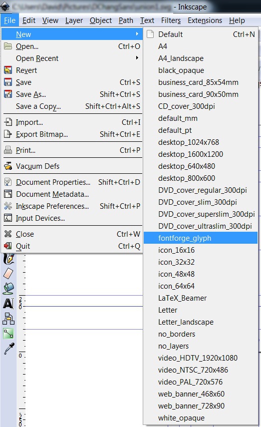
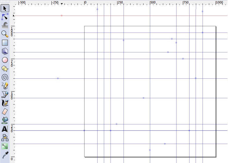
First, to create the letters, numbers, and punctuation, all of which are called glyphs, open Inkscape, and make a new "fontforge_glyph" file. This specific template comes with a baseline guide already present, and the overall dimensions are already set to match up with Font Forge, which is what we will use to actually make the font.

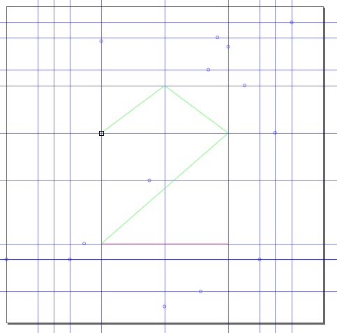
The first thing to do is to make all the guides that will help with making all the letters come out consistently. This can be done either by clicking and dragging from the top (for a horizontal guide) or left (for a vertical guide) margins where the measurements are present, or by drawing a rectangle (using the rectangle tool) or a line (using the Pen/Bezier tool and clicking two endpoints before pressing ENTER) and selecting Objects to Guide from the Objects menu. Once you have your guides, switch to the Pen/Bezier tool by clicking the icon on the left side of the window, or by pressing SHIFT and F6 simultaneously.

There are two ways to use this tool: you can either click on the endpoints in succession, or you may click and drag to the endpoint, which you would then need to click a third time to set the curvature of the line. I find the first method to be better for me. I make straight lines and later go in to fine tune the curvature. After making a rough sketch of the glyph, to stop making any further points, press ENTER.

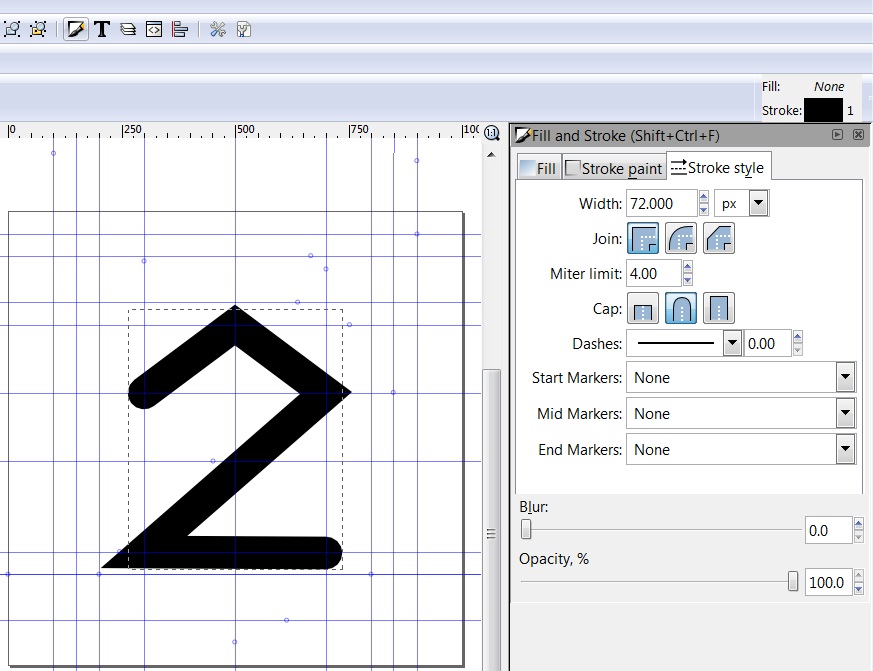
By default, the Fill is Black, and the Stroke is not set. To change this, locate the color palatte on the bottom of the window, and right click on the X color, and select SET FILL. The fill will then by set to None. Next, right-click on the black colored box, and select SET STROKE. Now, the stroke should be set. However, the stroke is detault to be 1 px thick. This would make the characters excessively thin. To thicken the stroke, click on the Fill and Stroke button at the top of the window, and click on the Stroke style tab. There are a couple customizations. The width I use is 72 px, giving the characters a moderate thickness. Also, I choose to round the corners by choosing a round cap from the selections. Also, depending on the character, I either have a square join, or a round join. You can experiment with what works for you.

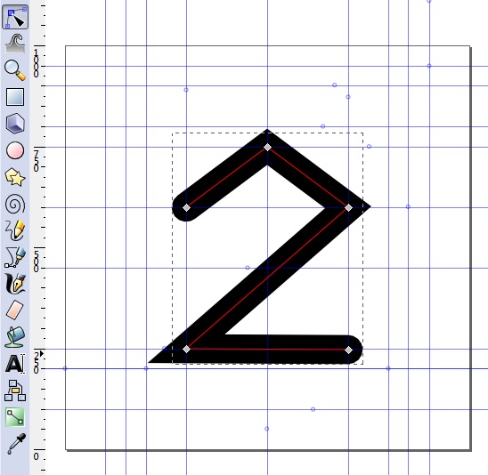
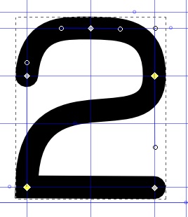
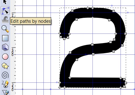
After setting the thickness, we now have a good enough picture to start fine tuning the glyph. Switch to the Node Tool, either by clicking the icon at the left side of the window, or by pressing F2. Now, the path should come out in red momentarily whenever your cursor passes by it. Clicking where the path was shown will select the path, even if the red path is no longer visible. It will also show the nodes.

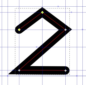
Clicking between two nodes again will allow you to fine tune the path between the two nodes.

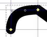
By clicking and dragging, you can change the straight line into a curved line. When this first happens, two circles will appear, attached one to each of the two nodes on either end. You make finer changes by clicking and dragging these circles around.

Make the according changes for each line segment.

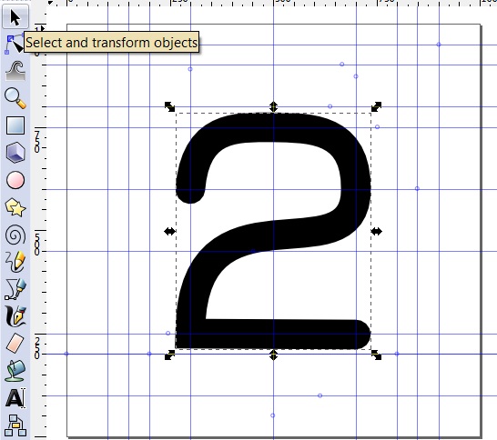
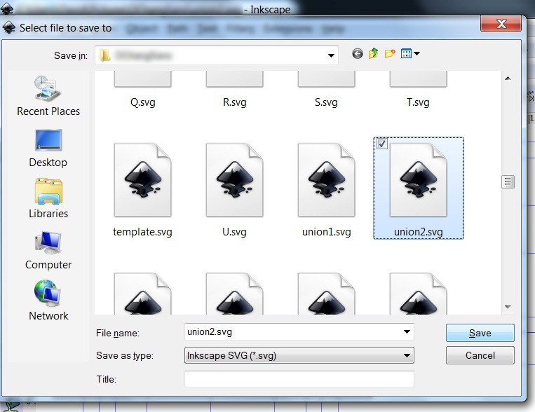
Once your glyph is ready, select the Select Tool (F1), and select the entire glyph by making a rectangle that encompasses the entire glyph. Before going on, it is advisable to save this glyph. With the changes to be made, you will not be able to come back to adjust the curvature or length of the path, etc. Saving it as a .svg file will save everything so that none of your work is lost.

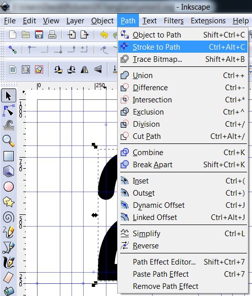
Next, click the Stroke to Path option under the Path menu. This will change the path from being a line in the center of the glyph, to being the outline of the glyph.

If you were to select the Node Tool, you can see how the path got changed.

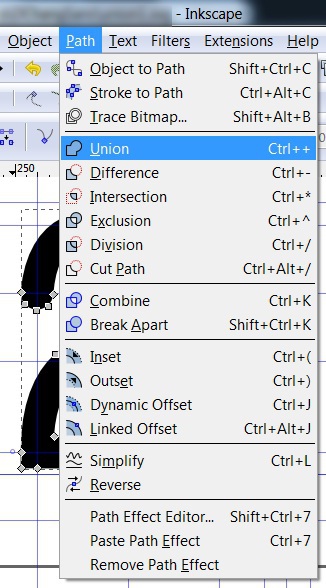
In addition, if the letter involved two separate paths (for letters like R, T, K, etc.), then selecting the Union option under the Path menu will produce an outline of the entire glyph, merging the intersections. The two steps just described will help resolve some conflicts which arise when generating fonts with FontForge.

After you have done that, the glyph is complete. Save it under a different name from the glyph before. Continue this procedure for all the glyphs. This is the most time-consuming part.

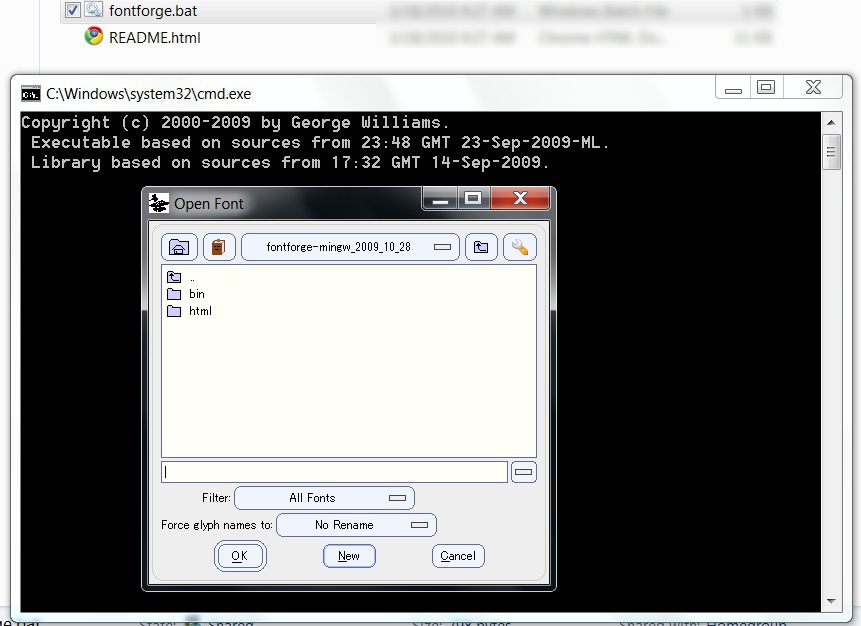
Once all your glyphs have been completed, launch FontForge. Create a new project.

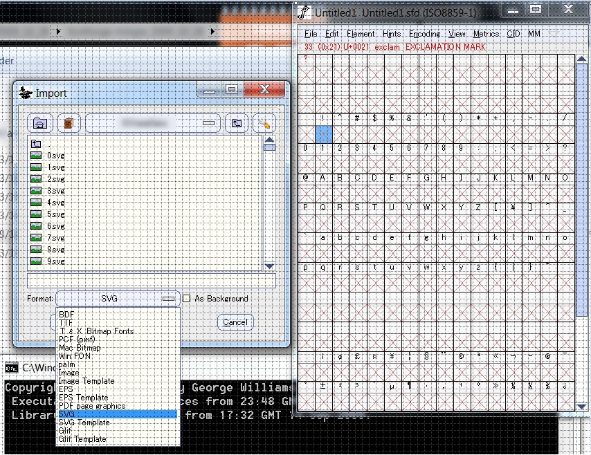
Click on each glyph, and press CTRL, SHIFT, and I at the same time to import a glyph. In the Open box, make sure that the format is SVG (sometimes SVG appears as the Format, but none of the files are shown. That means you need to select SVG again as the format). Choose the file that corresponds with the glyph selected. Perform the same procedure for all the glyphs.

Save the file, because now, we will do some more tuning with the width of all the characters.

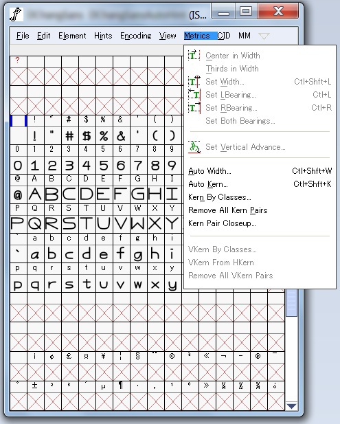
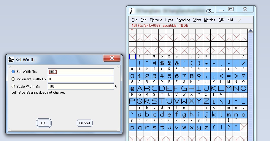
There are a couple of options under the Metrics menu which are pretty useful. We will look at Auto Width, Set Width, and Center in Width.

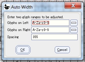
Auto Width automatically adjusts the width of each character and number, giving them the same amount of spacing on either side. This is very helpful, especially if your glyphs have different widths.

Set Width manually sets the width of the selected glyphs (you can select multiple glyphs either by clicking and dragging your cursor across multiple glyphs or by clicking on multiply glyphs while holding down the SHIFT key). Usually, you will need to select Center in Width right after setting the width.

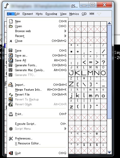
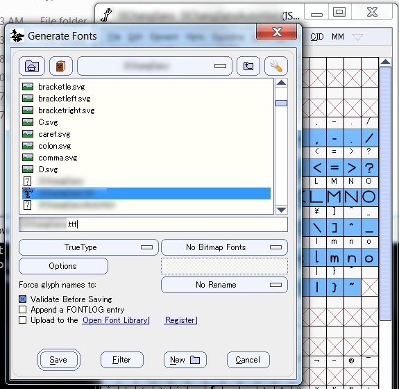
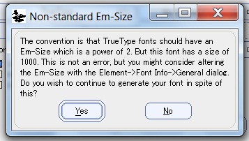
Once everything is satisfactory, select Generate Fonts under the File menu. Type in a name for the font, and click Save.

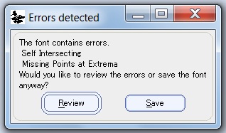
Some errors may come up. I have not had a problem just ignoring them.

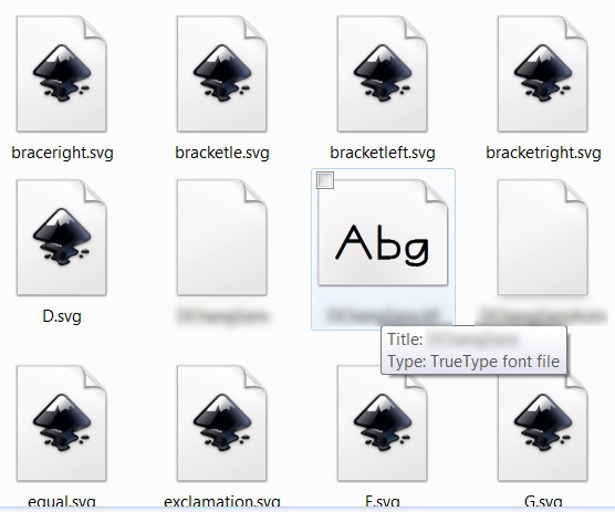
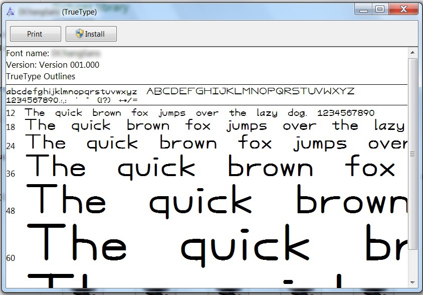
Now, you have your own .ttf file, which can be used either on your website, using font-face in css, or as a system font installed onto your computer.

Sources: [So you want to create a font. Part 1]
© Copyright 2025 David Chang. All Rights Reserved.